
Why Shared Power Bank User Experience Matters More Than Ever
The shared power bank user experience has become the single most decisive factor in determining whether a rental station thrives or fails. In a market where hardware specifications are increasingly commoditized and pricing competition is fierce, the quality of the user journey—from scanning a QR code to returning the power bank—directly impacts rental frequency, customer retention, and ultimately your bottom line.
According to a Statista report on the global sharing economy, user experience friction accounts for up to 67% of rental abandonment in shared services. For shared power bank operators, this means every confusing interface, every failed QR code scan, and every unclear return process is silently costing you revenue.
Baofeng Charge has pioneered a merchant-owned model that puts user experience at the center of the business equation—because when merchants control the entire flow, they can optimize every touchpoint for their specific customer base.
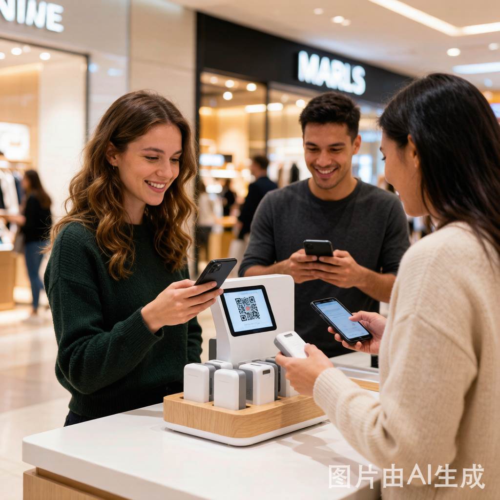
The Complete Shared Power Bank Rental User Journey
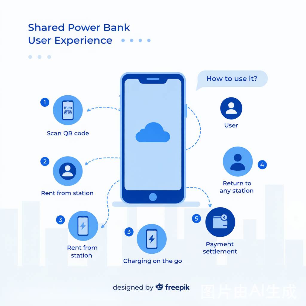
Understanding the shared power bank user experience requires mapping every touchpoint in the rental journey. A typical user flow consists of five critical stages, and each one presents opportunities for optimization—or friction that drives customers away.
Stage 1: Discovery & Awareness
The first moment of the shared power bank user experience begins before the customer even approaches the station. Visual discoverability is paramount. The station should be positioned where foot traffic naturally converges—near entrances, checkout counters, or waiting areas. Signage should be clear, colorful, and instantly communicate the service: “Scan QR → Get Power Bank → Charge On-the-Go.”
Merchants who strategically place stations within 3 meters of high-wait-time areas (checkout lines, seating zones) report 30-45% higher rental rates compared to stations tucked in corners or behind counters. Discovery is the gateway to the entire user experience.
Stage 2: QR Code Scanning & Initiation
The QR code scanning step is where most shared power bank user experience friction occurs. A poorly designed QR code experience—one that redirects to a slow-loading web page, requires app downloads before rental, or presents confusing registration forms—can lose up to 40% of potential renters at this single touchpoint.
Best practices for QR code UX optimization include:
- Instant access: QR codes should link directly to a rental action page, not a marketing homepage or app store
- Minimal registration: Allow one-tap rental through WeChat, Alipay, or Google Pay without mandatory account creation
- Large, scannable QR codes: Ensure codes are at least 3cm×3cm with high contrast, placed at eye level on the station
- Redundant access points: Offer NFC tap-to-rent alongside QR codes for users with NFC-enabled phones
- Error recovery: If a scan fails, display clear instructions with a manual entry shortcode as backup
Stage 3: Power Bank Retrieval
Once the user has initiated the rental, the physical act of retrieving the power bank must be instantaneous and intuitive. The shared power bank user experience suffers dramatically when stations have mechanical jams, unclear slot indicators, or require users to wait for a specific slot to unlock.
Modern stations should feature:
- Auto-eject mechanism: The power bank should slide out automatically upon successful payment authorization
- LED indicators: Green lights on available slots, red on empty ones, so users know exactly where to grab
- Spring-loaded slots: Prevent power banks from getting stuck half-way during retrieval
- Audio confirmation: A brief tone or voice prompt confirming “Rental successful—please take your power bank”
The entire retrieval process should take under 3 seconds from payment confirmation to power bank in hand. Any delay longer than 5 seconds creates anxiety and doubt, eroding the shared power bank user experience.
Stage 4: Charging On-the-Go
The charging phase might seem passive, but it significantly shapes the overall shared power bank user experience. The physical quality of the power bank itself—its weight, cable type, charging speed, and connector compatibility—determines whether customers feel satisfied or frustrated.
Key hardware UX considerations:
- Connector variety: Offer Type-C, Lightning, and Micro-USB cables integrated into the power bank body (no separate cables to lose)
- Fast charging capability: Support 18W+ PD/QC output to charge phones meaningfully in 30-60 minutes
- Ergonomic design: Lightweight (under 200g), slim profile that fits comfortably in hand or pocket alongside the phone
- Battery capacity: Minimum 5000mAh to provide at least one full charge for most smartphones
- Durability: Reinforced cable joints and scratch-resistant casing that withstands daily rental abuse
Stage 5: Return & Settlement
The return experience is the most overlooked phase of the shared power bank user experience—and arguably the most important for customer retention. A frustrating return process is the #1 reason users abandon shared power bank services after their first rental.
Common return UX problems and solutions:
| Problem | Impact on UX | Optimization Solution |
|---|---|---|
| Can’t find a return station nearby | User walks around carrying the power bank, feeling trapped | Map integration showing all return locations within app/web interface |
| Station slots are all full | User cannot return, rental keeps charging, frustration builds | Real-time slot availability displayed on map; overflow stations within 500m |
| Power bank doesn’t fit into slot | Physical awkwardness, fear of damage, repeated attempts | Universal slot design with auto-detection; any power bank from same network fits any station |
| Unclear payment settlement | User doesn’t know the final cost, feels overcharged | Instant push notification with exact duration and cost upon successful return |
| No return confirmation | User worries they didn’t return properly, keeps getting charged | Visual + audio confirmation (“Return successful—thank you!”) + immediate payment receipt |
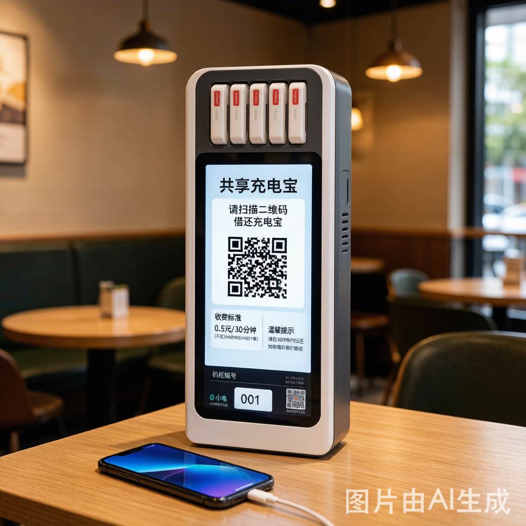
5 Critical UX Design Principles for Shared Power Bank Stations
Creating an exceptional shared power bank user experience requires applying established UX design principles to a physical-digital hybrid service. Here are five principles that should guide every design decision:
1. Zero-Learning-Curve Design
The shared power bank user experience should be so intuitive that a first-time user can complete a full rental cycle without instructions, tutorials, or help from staff. This means:
- Visual hierarchy: The QR code is the largest, most prominent element on the station front panel
- Progressive disclosure: Show only the current step (scan → take → charge → return), not the entire process upfront
- Consistent iconography: Use universally recognized symbols (power icon, QR symbol, arrow for insertion direction)
- No cognitive load: The interface should require zero decision-making beyond “scan and take”
Research from Nielsen Norman Group shows that systems requiring more than 3 steps to complete a core action experience 50% higher abandonment rates. The best shared power bank user experiences achieve the rental action in exactly 2 steps: scan + take.
2. Friction-Free Payment Integration
Payment is where the shared power bank user experience most frequently breaks down. Requiring users to download an app, create an account, link a credit card, and authorize payment before they can access a power bank creates a 5-step barrier that eliminates up to 60% of potential renters.
The optimal payment UX strategy leverages existing payment ecosystems:
- China market: WeChat Pay and Alipay mini-programs with auto-debit authorization
- International markets: Google Pay, Apple Pay, and local e-wallets (GrabPay, Touch’n Go, LINE Pay)
- Deposit-free models: Pre-authorized credit card holds instead of upfront deposits, reducing perceived financial risk
- Transparent pricing display: Show per-hour cost prominently on the station screen before rental begins
Merchant-owned stations (like Baofeng Charge‘s model) can further optimize payment UX by integrating rental fees into their own loyalty programs—offering free charging minutes as membership perks, which transforms the payment experience from a transaction into a value-added service.
3. Contextual Placement Strategy
The shared power bank user experience is profoundly shaped by where the station is placed within a venue. Context determines need, urgency, and willingness to pay. The same station placed at a restaurant entrance versus a cinema lobby will yield vastly different rental rates and user satisfaction.
High-performing placement contexts and their UX implications:
- Restaurants & cafes: Users have 30-90 minute dwell time; price sensitivity is low because they’re already spending. UX priority: seamless rental without leaving the table
- Shopping malls: Users walk continuously; they need quick grab-and-go access. UX priority: stations at circulation nodes (escalators, elevator lobbies, restrooms)
- Hotels & airports: Users have extended dwell time and high device dependency. UX priority: multiple stations throughout the property, 24/7 availability
- Bars & nightlife venues: Users have impaired attention and high urgency. UX priority: ultra-simple interface, large QR codes, forgiving return policies
- Office buildings: Users have predictable daily patterns. UX priority: subscription models and enterprise billing integration
4. Feedback & Confirmation at Every Step
Human factors research consistently shows that uncertainty is the primary driver of user anxiety in transactional systems. Every action in the shared power bank user experience should produce immediate, unambiguous feedback:
- QR scan confirmed: “Scanning successful—select your power bank” (visual + audio)
- Slot unlock confirmed: Green LED flash + power bank auto-eject + “Please take power bank” audio
- Rental active confirmed: Push notification with timer, cost estimate, and nearby return locations
- Return confirmed: “Return successful—total charge: $X.XX” displayed on station + push notification receipt
Silence and ambiguity in the shared power bank user experience—no confirmation sound, no visual feedback, no receipt—creates distrust and reduces repeat rental likelihood by up to 35%.
5. Graceful Error Handling & Recovery
No system is perfect. The difference between a good and great shared power bank user experience lies in how errors and edge cases are handled:
- QR scan failure: Display “Please try again” with a manual 6-digit shortcode option as backup
- Power bank stuck in slot: Station detects jam, displays “Press button below to retry eject,” auto-reports to maintenance
- Return station full: App shows nearest alternative station with walking distance, extends rental grace period by 30 minutes
- Payment processing error: Clear message explaining the issue + retry button + alternative payment method suggestion
- Bluetooth/wifi disconnection: Offline rental mode that caches transactions and syncs when connectivity resumes
Each error recovery path should be shorter than 2 steps and never require the user to contact customer service for basic issues. The goal is zero-abandonment: even when something goes wrong, the user should feel empowered to resolve it immediately.
App vs. Mini-Program: Choosing the Right Platform for Your Market
The platform choice for your shared power bank user experience is a market-specific decision with significant implications for adoption rates and operational costs.
Mobile App Approach
A standalone app offers the richest shared power bank user experience—full map integration, account management, rental history, push notifications, and loyalty features. However, the app download barrier eliminates 40-60% of first-time renters who simply won’t install another app for a service they use occasionally.
Apps work best in markets where:
- The service has high repeat usage (daily commuters, regular venue visitors)
- Users already download apps for similar services (ride-sharing, food delivery)
- Advanced features like subscription plans, corporate billing, or multi-language support are needed
Mini-Program / Web App Approach
WeChat mini-programs and web-based interfaces offer near-zero friction access—the user scans, the interface loads within the ecosystem they already use, and the rental completes without any installation step. This approach preserves the highest possible conversion rate for the shared power bank user experience.
Mini-programs work best in markets where:
- China: WeChat is universal; mini-program rental achieves 85%+ scan-to-rental conversion
- Southeast Asia: LINE (Japan/Thailand/Taiwan), Grab (SEA), and local e-wallet ecosystems provide similar friction-free access
- Global markets: Progressive web apps (PWAs) offer instant access with offline caching for return functionality
For most shared power bank deployments, the mini-program/PWA approach is superior for first-time users, while a companion app serves loyal repeat customers. The best shared power bank user experience strategies offer both, with the mini-program as the primary entry point and the app as an upgrade path.
Shared Power Bank UX Metrics: What to Measure & How
Optimizing the shared power bank user experience requires systematic measurement of key performance indicators. Without data, you’re guessing—and guessing is expensive.
Core UX Metrics to Track
| Metric | Definition | Benchmark | Optimization Target |
|---|---|---|---|
| Scan-to-Rental Conversion Rate | % of QR scans that result in successful power bank rental | 45-60% | 75%+ |
| First-Rental Completion Rate | % of first-time users who complete full rental cycle (rent + return) | 70-80% | 90%+ |
| Average Rental Duration | Mean time from rental to return | 60-90 min | 45-75 min (shorter = more turnover) |
| Repeat Rental Rate | % of users who rent again within 30 days | 15-25% | 40%+ |
| Return Abandonment Rate | % of rentals where power bank is not returned within 24 hours | 3-5% | Under 2% |
| Error Rate per Transaction | % of rental cycles with at least one error (scan fail, jam, payment issue) | 8-12% | Under 3% |
| Net Promoter Score (NPS) | User likelihood to recommend the service | 20-35 | 50+ |
Measurement Methods
Each metric requires specific measurement infrastructure:
- Backend analytics: Track every API call (scan, authorize, eject, return, settle) with timestamps
- Station sensors: Monitor slot occupancy, eject success/failure, power bank battery levels
- User feedback: In-app/mini-program 1-question micro-surveys after return (“How was your experience? 1-5 stars”)
- A/B testing: Test QR code placement, pricing display format, return confirmation language
- Heat mapping: Track which station areas users interact with most (QR zone, slot zone, instruction zone)
The Merchant-Owned Model: UX Advantage
The traditional platform-owned shared power bank model forces merchants into a passive role—they provide the space, but the platform controls the entire shared power bank user experience. This creates fundamental UX misalignment:
- Generic pricing: Platform sets national pricing that doesn’t match local customer demographics
- Brand disconnect: Platform branding overrides merchant identity, creating visual clutter in the venue
- No loyalty integration: Platform apps can’t integrate with merchant membership programs
- Slow iteration: Merchants can’t customize QR messages, pricing tiers, or promotional offers
The Baofeng Charge merchant-owned model eliminates these UX constraints. When merchants own the station and control the rental flow, they can:
- Customize pricing: Set rental rates appropriate for their customer segment ($0.50/hr at a casual cafe vs. $2/hr at a luxury hotel)
- Integrate loyalty programs: Offer free charging minutes as membership rewards, birthday perks, or spend-threshold bonuses
- Maintain brand consistency: Station design, QR landing page, and return confirmation reflect the merchant’s visual identity
- Iterate rapidly: Adjust pricing, promotions, and UX elements in real-time based on their own customer feedback
- Create value-added services: Rental receipts include merchant discount coupons, driving secondary purchases
This alignment between station ownership and user experience design creates a virtuous cycle: better UX → higher rental rates → more revenue → more investment in UX → even higher rates. Platform-owned stations cannot achieve this cycle because the UX decisions are made by a distant platform optimizing for aggregate metrics, not individual venue performance.
International Market UX Considerations
Expanding shared power bank services internationally requires significant UX adaptation. The shared power bank user experience that works perfectly in Shanghai may fail completely in Bangkok, Jakarta, or São Paulo.
Cultural UX Adaptations
- Language localization: Not just translation, but cultural adaptation of instructions, error messages, and pricing display formats
- Payment ecosystem integration: Each market has dominant e-wallets—WeChat/Alipay in China, GrabPay in SEA, LINE Pay in Japan/Thailand, Pix in Brazil
- Trust signals: Different cultures respond to different credibility markers—brand partnerships, celebrity endorsements, or government certifications
- Color psychology: Green means “go” in most Western markets but carries different associations in some Asian cultures
Regulatory UX Requirements
International markets impose specific regulatory requirements on the shared power bank user experience:
- GDPR (Europe): Explicit consent for data collection, clear privacy policy links on the rental interface
- PDPA (Southeast Asia): Similar data protection requirements with local variations
- Consumer protection laws: Clear pricing disclosure, maximum rental caps, and dispute resolution access
- Accessibility standards: WCAG compliance for digital interfaces; physical accessibility for station design (height, reach, visual contrast)
Future Trends in Shared Power Bank UX
The shared power bank user experience is evolving rapidly, driven by technological advances and changing consumer expectations. Here are the trends that will reshape the industry in the next 2-3 years:
AI-Powered Personalization
Machine learning algorithms will analyze rental patterns to personalize the shared power bank user experience:
- Dynamic pricing: Rates adjusted based on demand, time of day, and individual user history
- Predictive station management: AI predicts when stations will run low and triggers redistribution before depletion
- Personalized promotions: Loyalty rewards tailored to each user’s rental frequency and preferred venues
Contactless Everything
The pandemic accelerated contactless technology adoption, and the shared power bank user experience is following:
- NFC tap-to-rent: Bypass QR codes entirely with a simple phone tap on the station
- Biometric authorization: Face recognition rental for markets with strong biometric payment infrastructure
- Auto-return detection: Stations detect approaching users with active rentals and pre-allocate return slots
Sustainability UX
Environmental consciousness is becoming a shared power bank user experience factor:
- Eco-impact dashboards: Show users how many disposable batteries their rental replaces
- Green station design: Solar-powered stations, recycled materials, carbon-neutral operations
- ESG reporting: Merchants receive sustainability metrics to include in their environmental reporting
According to Mordor Intelligence’s power bank sharing service market report, the global shared power bank market is projected to grow at 28.5% CAGR through 2030, with user experience quality emerging as the primary competitive differentiator.
Implementation Checklist: Optimize Your Shared Power Bank UX Today
Whether you’re a venue owner considering your first station or an operator managing hundreds of locations, this actionable checklist will help you systematically improve your shared power bank user experience:
- Audit your current UX flow: Walk through every step as a first-time user. Note every moment of confusion, delay, or friction
- Measure your scan-to-rental conversion rate: If it’s below 60%, your QR/initiation UX has significant problems
- Test your return process: The #1 retention killer. Can users find return stations easily? Are slots available? Is confirmation instant?
- Review your payment flow: Count the steps from scan to payment authorization. More than 3 = too many
- Check your station placement: Is the station within 3 meters of natural foot traffic? Is signage visible from 10 meters?
- Evaluate your hardware UX: Does the power bank offer all three connector types? Is it under 200g? Does it charge at 18W+?
- Implement feedback at every step: Add audio/visual confirmations for scan, eject, rental start, and return
- Design error recovery paths: For every possible failure (scan fail, jam, station full), create a 2-step or less recovery path
- Localize for your market: Language, payment, trust signals, and cultural UX preferences must match your customer demographics
- Set up measurement infrastructure: Backend analytics, station sensors, user micro-surveys—data-driven UX optimization beats intuition every time
Conclusion: User Experience Is Your Competitive Moat
In the shared power bank industry’s next phase, competitive advantage will not come from having the cheapest power banks or the most stations. It will come from delivering the best shared power bank user experience—the one that makes renting feel effortless, returning feel satisfying, and repeating feel natural.
The merchants who understand this shift and invest in UX optimization—whether through the merchant-owned Baofeng Charge model that gives them full control over the rental journey, or through careful platform partnership selection—will capture disproportionate rental revenue and customer loyalty.
The shared power bank user experience isn’t a nice-to-have feature. It’s the product itself. And the operators who treat it that way will define the industry’s future.